
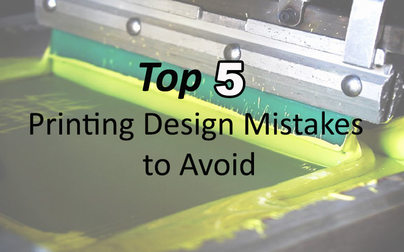


There is nothing fun about creating custom t-shirts only to fail due to design mistakes. To aid in that endeavor, we’ve created our compilation of what not to do when designing your custom t-shirt for printing.
Keep away from these errors, and your t-shirt design is far more likely to be a smashing hit.
1. Using the Wrong Material
Ok, hear us out. The right material can make all the difference in t-shirt printing. We’re not just talking about hand feel, however. The makeup of the material can have a massive effect on the outcome of the t-shirt print.
For example, if you are working with sublimation printing, you need a 100% polyester (or very close) fabric to work correctly. For screen printing, a cotton or cotton blend, like these Hanes best-sellers, is what you need. The simple but easily overlooked idea of starting off with the right material sets your shirt on a path to success.
2. Putting the Design in the Wrong Place
Even an ideal material t-shirt can become a failure if the design is in the wrong place. A lot will hinge on the physical size and detail of your logo. Larger logos work best when placed in the middle of the shoulders or chest. Smaller logos, however, often work well on the pocket, the off-center of the front, or the front and center of the chest.
In general, you want your design to be in an eye-catching location so that it draws attention to itself. This means that the bottom half of the shirt and sleeves are not going to cut it most of the time.
3. Having Too Much Detail in your Logo
Here’s the thing, while an intricate logo can look fantastic, it can also get muddled in the printing process. This is true whether you are screen printing, using sublimation printing, or vinyl pressing. Too many small details in your logo can make the shirt look messy if not printed correctly.
4. Using the Wrong Size Logo
Sizing your logo appropriately for the space where it is going to be printed is everything. If the logo is too small in a larger space, it will be unreadable and look lost in the sea of blank t-shirts surrounding it. On the other hand, a logo that is too large for the area will be overwhelming to look at. Be sure that your design is scaled correctly to the shirt itself.
5. Having Too Much Contrast
While contrast can be an effective tool to draw attention to the message, too much contrast can detract from the design. When choosing your colors, t-shirt design, and color elements, be sure that it forms a cohesive picture, not a contrasting mess.
Bonus Tip
While we cannot guarantee that your design will always be a smash, we can help guide you as best we can. Subscribe to our blog for the best t-shirt tips and products.
New comment
Comments