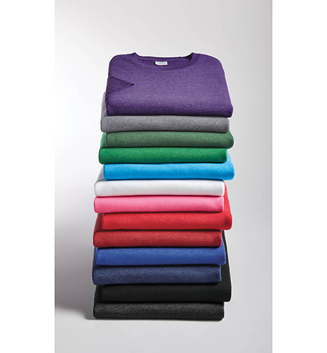
Every screen printer knows that garment colors play a huge role in how certain embellishments will look on the end product. Garment colors communicate both personality and emotion, making it a powerful driver for brand activation.
By starting with the best suited colors and design techniques, we’ll show you how top printers are making some of the most eye-catching garments around.
Step 1 - Preparation is Everything
To really make colors pop, you should start by cleaning up your desired imagery in editing software programs like Photoshop. This will help you achieve the best resolution possible and you can incorporate additional effects to bring about the best looking final product.
Step 2 - Deciding Fabric Colors
Your garment’s fabric is the canvas from which your ink will bring your artwork to life. Selecting ink colors that complement your garment colors is all about the best imagery possible. For example, bright garments pair well with black and white imagery.
When printing on dark colored t-shirts with DTG printing, you’ll need to make sure to use a pretreat but also keep in mind that this will affect printing on both sides so you’ll probably want to choose one side or the other. Keep variables like these in mind.
Step 3 - Choosing the Right Ink
There are many different types of inks that yield different results. From plastisol, the de facto kind of screen printing, to water-based inks which are literally ingrained in the fabric, inks play a huge role in the final look.
Get an insider’s look into the process of garment colors and t-shirt printing design with the Bella + Canvas video below.

New comment
Comments